7 Bedroom Design Mistakes You Should Stop Making Now
Posted in Angelcityfurniture
There’s some wacky but true stat that says we spend about one-third of our lives in bed. The bulk of that time is spent sleeping, but there may be a little bit of active awake time in there, streaming Netflix or otherwise hanging out. And no matter the activity, your surroundings are important. With that in mind, make 2019 the year that you actually get your act together—at least in terms of bedroom design. Stop making these bedroom design mistakes, and you’ll be that much happier about your sleep space.
1. Your Wall Color is Jarring

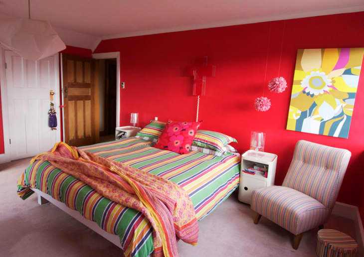
Take it from me—a person that once, regrettably, painted her bedroom red and later watched a roommate make a similar mistake, opting for teal walls that turned out as green as the Joker from “Batman”. Not a good look. The bedroom should be a low stimuli sanctuary, not vibrating and energetic. For a more soothing environment, stick to lighter, softer shades. And if you really want something moody and saturated, try a deep charcoal or navy.
2. Your Rug is Way Too Small, or Worse, You Have No Rug
If you have wall-to-wall carpeting in your bedroom, this doesn’t apply to you. But if you have wood or some other type of flooring, an area rug will go a long way in warming up your space. Just make sure the rug you pick isn’t too tiny or awkwardly positioned in your room. Sheepskins are super cozy, but they’re best next to a bed, not under it. As for area rugs, shop for something wide enough to extend out from the sides of the bed. You want the rug to be visible and help prevent cold feet in the morning.
3. The Bed’s Too Big for Your Space
No matter how tempting a big bed is, don’t size up if you’re dealing with tight quarters. A bed that’s too big will leave you with a lack of walking room and storage space. Plus, a huge headboard/bed frame can make your bedroom seem cramped even when it’s not. Take this bedroom for example: The homeowner definitely got the hide rug placement right, but the room would feel more balanced without the four-poster bed.
4. Your Layout Blocks Natural Light Sources
Any time you put something in front of a window, your natural lighting takes a hit. If you have other natural light sources, you may be able to get away with it. But if you must, adding more sources of lighting—overhead, tabletop, and floor lamps—can help keep your space bright. You can also choose a no headboard setup or a low-profile bed frame to minimize the loss of light.
5. Your Furniture is Too Matchy-Matchy
Good designers will tell you not to buy a full bedroom set—you know, those all-inclusive bed, bedside table, dresser, and mirror combos. Why? It zaps personality from your space. If you do have one of these sets, give your space a refresh by breaking it up. Consider finding new nightstands, for example, and repurposing those original tables elsewhere in your home. The best rooms look like they’re assembled over time, with a balance of new and old furnishings in different shapes and finishes.
6. The Bed is So Low, It’s on the Ground
If your bed is on the ground, it’s time to consider an upgrade. A bed that sits higher off the ground tends to feel a little grander (and who doesn’t want a room that feels like a personal castle?) and more purposeful in the space. Plus, lifting the bed from the ground is a great way to open up storage space. You could opt for a bed frame that comes with built-in drawers, or use boxes to store excess items under a more traditional frame.
7. Clutter is Everywhere
You want your bedroom to feel like you and have some personal effects; without it, a room can look a little too American Psycho . But you don’t want an excess of frames, tchotchkes, and furniture either. Keep your furnishings meaningful but minimal—and try to stay on top of clutter. Return items to their proper spaces and designate a drop zone—a bench, a chair—for clothing or items that don’t get put away immediately. This homeowner is halfway there—the bench is a great temporary spot for clothing and accessories, but all of those pillows and mirrors are a bit distracting.