A 1930s Apartment Gets a Crisp and Elegant Bathroom Design
Posted in Angelcityfurniture
Asked to gut-renovate a dark and dreary apartment on New York City’s fabled Central Park West, designer Laura Bohn found inspiration in the 1930 building’s original Streamline Moderne–style lobby, an elegant expanse that could double as the set of a Fred Astaire—Ginger Rogers movie musical. “The lobby was full of classic Deco motifs—lashings of marble, bronze ribbing on the walls, etched glass,” Bohn says. “With my clients’ enthusiastic encouragement, I re-created many of those elements in the apartment upstairs, particularly in the master bath, which was ugly, pokey, and impractical.” Completely reconfigured and redesigned, the bathroom evokes 1930s glamour not by slavishly reproducing the iconic style but by freely reimagining it in contemporary terms. The space functions better and—thanks to improved natural and artificial lighting—also looks brighter, bigger, and more welcoming. Here’s how Bohn did it.

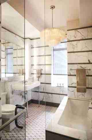
Bohn used matte brown porcelain tiles to create horizontal stripes between the statuary marble wall tiles. “Those strong lines make the space seem bigger and more imposing,” she says. “The tub surround is also statuary marble—the brightest Carrara with the most distinctive pattern—which helps unify the space.” As do the Deco-inspired sink, toilet, and bathtub, all by Lefroy Brooks .

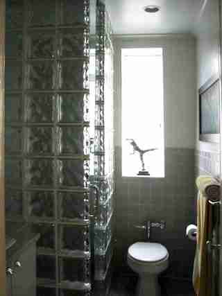
The bathroom was cramped and poorly lit. To remedy this, the shower was encased in glass brick—a favorite Streamline Moderne material—which looked uncharacteristically clunky and overpowering in the confined space. Wall tiles of a dull, indeterminate color only added to the room’s sad, institutional feel.

The gray, white, and nickel color palette is muted and harmonious, which allows for the boldly graphic Ann Sacks mosaic tile floor with dark grout that matches the stripes on the walls. The jewel-like custom chandelier—a mouth-blown glass wonder from Craig van den Brulle—ups the bathroom’s glamour quotient several notches.
The sink sits on a period-appropriate nickel-plated stand beneath a useful shelf. Bohn wall-mounted the medicine cabinet in a recess above the sink. She then used LED strips to illuminate the sides of the cabinet, creating a halo of warm, friendly light around the mirror—perfect for applying makeup and other tasks.
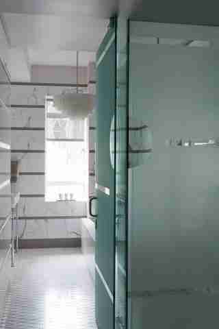
Bohn replaced the wall between the master bath and the bedroom vestibule with a custom etched-glass partition and door. “That lets light into the vestibule, opening up the space,” says Bohn. “The circle and stripes of clear glass not only reference Deco motifs that appear elsewhere in the apartment and building but also allow glimpses of the bathroom and the view through the window beyond.”