Ideas for Styling A Rustic Elegant Living Room
Posted in Angelcityfurniture
Hi Friends! I’m feeling a bit nervous and running around a bit this week, because Romantic Homes magazine is coming to shoot our home in just a few days. EEK!! I’m super excited and of course am looking at every space in my house with an extra critical eye. As I was re-styling my living room (for the tenth time!) I realized that I have never shared the entire living room with you guys…so here it is!

This is the space opposite our seating area, where our piano sits. In all honesty, I have struggled with how to style this area since we moved in this house. Because the piano sits in the corner, there is a kind of awkward wall space next to it that is too small for a seating arrangement, but too big to leave blank. We have tried several different furniture pieces in this room, from tall armoires to chairs and tables, like you see below, but nothing really worked well or made sense.
While I liked the chair and table arrangement above, it never really worked because it just felt “lonely”…especially since on the opposite side of the room was a full seating arrangement. I shared all of the details on HOW I STYLED THIS ROOM a couple of weeks ago.
The opposite side of the room with a spring topiary styling on the accent table.
So with the magazine shoot happening I decided I better figure this wall out once and for all. Luckily, inspiration struck when I was in our guest bedroom. There was a desk in there, under the window, that was never used, except occasionally when we had houseguests. It occurred to me that we had never tried it in our living room. (maybe one of the only pieces of furniture we haven’t put in there…)
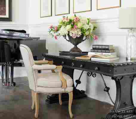
I convinced my husband to help me drag it out there (and we literally dragged it because it weighs a TON!) and lo and behold it was the perfect fit!! It filled in the wall beautifully, without being too overpowering and gave me a great opportunity to add some pretty styling to my living room.
It provided the perfect anchor for the framed sheet music I got from Restoration Hardware a couple years ago. (Sorry to say those pieces are currently not available)
I am a huge fan of books…new and old, so adding the desk gave me the perfect place to display some of my favorites. I also added this simple lamp (also from he guest bedroom) because the shade blends nicely with the framed art and chair.
I recently found this vintage botanicals book with hand painted prints and I love how it looks sitting open on the desk. Again a repeat of the pretty linen color. I often stack leather bound books in vignettes on tables.
And of course every new surface is a place for me to add a flower arrangement. I especially love that this area is big enough for a large arrangement in this vintage urn. I can imaging changing this arrangement often depending on the season.
The blend of vintage and more modern or streamlined is the perfect combination to get that rustic elegant look I like so much.
The final touch was this simple linen armchair with an embroidered pillow. I kept the look really simple and classic, but still in line with the style that I love.
Overall I am really happy with how this little corner looks now and think I’ve finally found the right look in this room. At least for now…
Have a great day friends!