See How a Historic Manhattan Apartment was Updated Without Losing its Architectural Integrity
Posted in Angelcityfurniture
This article originally appeared in the November 2011 issue of Architectural Digest.
Peter Shelton and Lee F. Mindel are the rare modernist architects who can put their imprimatur on a historic space without gutting it. When a prominent Manhattan philanthropist came to them about updating an apartment in a grand prewar building overlooking Central Park, they approached the project as both archaeologists and anthropologists. “We had to respect its legacy,” says Mindel, who notes that the type of families who have lived at this address over the past 80 years have their names on museums and hospital wings. “It’s not just the architecture, but the role of the apartment in the life of the city,” he adds. “This is meant to be a civic place.”
Appropriately, the client has a keen sense of noblesse oblige. “I am on quite a few boards and do a lot of entertaining for charities, and I wanted all sorts of people to feel comfortable here,” she explains. The generously scaled public rooms, which face the park and adjoin two terraces, allow for gatherings of as many as 250 people.
Choosing the firm Shelton, Mindel & Associates was a radical move for her. A childhood friend of Mindel’s, she bought the place after living in a traditionally decorated duplex for over two decades. “Most of Lee’s work is more modern than I would normally be comfortable with,” she admits. “It was a leap of faith to hire him, but he understood my vision.” The partners found ways of making the apartment sleeker and less baroque without violating its architectural integrity; they added new lighting, for instance, and opened up the foyer to the living room. “Peter did extensive forensics and due diligence to maintain the spirit of the past,” Mindel says.
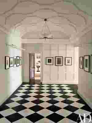
The steady stream of guests who make their way here now enter a large foyer that resembles the lobby of a private club; it has restored checkerboard-marble floors and a new barrel-vault ceiling. Vintage photographs of New York line the walls. “The photos are my homage to the city,” the owner says. “Someone said it seems as if I am a photography collector who also owns some paintings, but it’s really the other way around.”
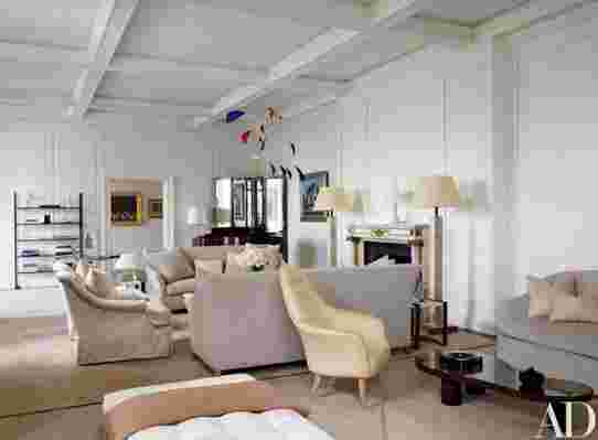
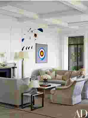
Indeed, her museum-quality collection of American paintings demanded restrained decorating. “When you have art like that, as well as spectacular park views, you don’t want distractions,” Mindel says. In the living room, textured fabrics in shades of pale stone were used for upholstery and a triptych of V’Soske rugs incorporating architectural, botanical, and zoological motifs was designed for the space in monochromatic, light-reflecting silk. The room’s gilded cake-frosting paneling was removed and reinstalled in the master bedroom. “We painted [the paneling] all white, and it’s almost like a Nevelson,” Mindel explains. They also swapped the ornate marble mantelpiece from the living room with the simpler bedroom version; now, with a crystal chandelier from the owner’s previous apartment and a Louis XVI–style headboard, the master suite has a refined, subdued opulence.


In the paneled library the architects counterbalanced the old-world hauteur with a contemporary aluminum-and-glass desk by Tom Dixon. “It looks like a butterfly that flew in from the terrace,” Mindel says. The solarium, which was restored according to rotting blueprints Shelton discovered buried within a wall, has both the original wrought-iron birdcage and new aluminum-and-wood Tourterelle chairs by François-Xavier Lalanne, all of which are a wink to the Central Park Zoo across the street. The baronial dining room features horsehair-upholstered Louis XVI–style chairs surrounding a pair of streamlined square oak tables. And instead of displaying a painting above the living room fireplace, the architects cleverly hung an Alexander Calder mobile that casts a dramatic shadow as the sun sets.
Modernization was also in order for the kitchen wing, which the architects transformed—though they did repurpose some of the St. Charles cabinets a prior owner had installed. “It’s now an eat-in kitchen,” says Mindel, pointing to a table encircled by rainbow-color French bistro chairs. “Unlike the old days when kitchens were strictly off-limits, guests feel comfortable wandering in here.” Since the owner did not plan to have live-in help, the adjacent maids’ rooms were replaced with a small gym, a windowed laundry room, and an office for a personal assistant. “They can easily be turned into servants’ quarters again,” says Mindel, the anthropologist in him peeping through.
Despite its majestic air the apartment does not feel overwrought or precious. “You never focus on a single thing,” Mindel observes, “but you feel an integration of architecture, art, and landscape.”
His good friend and satisfied client agrees, adding that Shelton, Mindel got the balance of modernism and classicism just right. “As formal as the apartment is, people tell me it is not intimidating,” she says with obvious pleasure. “Guests feel startled by the beauty, but not awed by it.”