The Good, the Bad, and the Ugly of Our First Kitchen Renovation
Posted in Angelcityfurniture
When my husband and I started shopping for an apartment in Brooklyn, we knew the deal. We had read those alarmist reports in The New York Times' real estate section; we had listened as friends recounted their house-hunting horror stories. We weren’t looking for perfection—we were looking for a floor, a ceiling, and walls.
So Eric (the digital general manager at AD and three other brands) and I pared down our requirements to two: We wanted as much square footage as possible, and we wanted to stay in Downtown Brooklyn, the rapidly changing sliver of the borough where we had lived for six and a half years as renters. The neighborhood is neither cute nor charming—if you’re looking for a chic wine bar, you’ll have to settle on a blinged-out liquor store with action films streaming on flat-screen TVs instead—but it’s home.
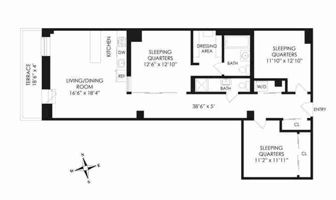
Last fall we closed on a 1,230-square-foot loft in a 1920s Art Deco building. The unit seemed cool, with high ceilings, exposed pipes and beams, bamboo floors, and tons of storage. But much like the neighborhood, it’s somewhat unusual, with a long, wide corridor that runs from the front door, past two windowless bedrooms and a windowless TV lounge, and into a 300-square-foot room with one tiny wall of appliances.

I’m not superstitious, but when Steve announced that demo would begin on May 1, or May Day— mayday, mayday! —I knew we’d need a survival plan
Shortly after moving in, a generous housewarming gift from my parents changed the game, and we embarked upon Project Dream Kitchen. We found our guy (Steve Friedson, an affable general contractor with the best firm name of all time, Leave It to Steve ) on the home-renovation site Sweeten , and we had what we felt was a fantastic plan: an L-shaped kitchen with floor-to-ceiling pantry cabinets, a six-foot-long island, and a built-in workspace for Eric, who’s usually up—and bothering his staff with emails—before dawn. Although we would mount a TV (mostly to feed our steady diet of political news), Steve encouraged us to create a true working kitchen. Leave the House of Cards binge-fests for the den down the hall.

DON'T BE AFRAID TO. . . We did something rare in New York: We separated functions, devoting the entire 300-square-foot room to the kitchen and moving our TV-watching to a room down the hall.

DECISIONS, DECISIONS: We wanted a fresh, contemporary, comfortable feel, mixing cabinet doors with open shelving and balancing slick, man-made surfaces (like stainless steel) with natural materials like wood.
Unbeknownst to us, though, condo approvals aren’t built in a day—particularly not in a landmarked building with paper-thin walls. Ours took months, not to mention more than a few demanding calls and emails to the building management office. The limbo period tested my patience; I knew things had gotten bad when I found myself verbally chiding a grown man (who does not, in fact, work for me) on his “communication style” and “aptitude for follow-through.”
I’m not superstitious, but when Steve announced that demo would begin on May 1, or May Day— mayday, mayday! —I knew we’d need a survival plan. Eric Marie Kondo’d our TV room into a kitchenette, complete with a half-size fridge and makeshift pantry. We—well, Eric—did dishes in the shower, a task that utterly grossed me out. I had grand plans to learn how to sous vide but ended up cooking so many stir-frys on the induction burner that Eric had borrowed from the Epicurious test kitchen that I can’t bear to see another jar of Thai Kitchen’s green curry paste. Our pup, seemingly psyched to be under quarantine with his two favorite people, adapted best of all. Then, after about a week, I high-tailed it out of town on a bunch of international assignments because, let’s face it: Hanging out on the French Riviera is great any day, but it’s a particularly pro move when you’re living on top of each other in a construction zone.
SAVE VS. SPLURGE: Our basic ceramic backsplash only cost $1.76 a square foot at Home Depot ; it’s an industrial companion to the gorgeous (and pricey) faux-marble Caesarstone countertops. The placement of the sink, dishwasher, and open shelving (also from 3 Dot Design ) has made the cleanup flow effortless.
WORK IT: Eric starts his mornings at the built-in desk (custom from 3 Dot Design ), which is topped with a slab of black walnut and sandwiched into a massive wall of floor-to-ceiling pantry cabinets. Oscar, our five-year-old Cavalier King Charles spaniel, assumes his rightful place on his throne, a.k.a. West Elm’s Saddle dining chair .
You know those HGTV episodes where the wife loves Art Deco and the husband loves steampunk? Not us; we gamely agreed on fresh, contemporary, not-too-stark design details, like white and gray Shaker cabinets (an investment) with brass pulls, dirt-cheap ceramic tile with asphalt grout, and simple glass pendants. Eric commissioned black-walnut slabs—for the open shelves, island top, and desktop—from Brad Leone, his Bon Appétit colleague (star of the video series “It’s Alive with Brad” ) and Adam Papanestor, who together own 3 Dot Design , a custom furniture studio.